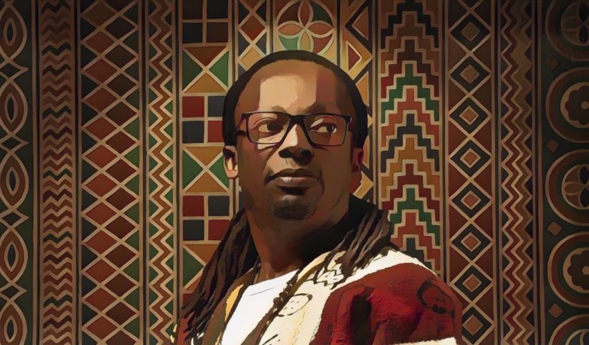
The sun settles late over the warm streets of Abidjan, casting long shadows against pastel buildings and bustling markets. In a quiet studio not far from the city’s vibrant heart, a designer sits at his desk, staring at pixels that mean more than shapes and colours. They are the echoes of identity, the silent personality of a brand waiting to speak.
This is Vilevo Symenouh: a Creative Director, brand architect, and visual storyteller whose work does more than shift aesthetics; it reshapes perception, reframes narratives, and restores dignity to the visual language of brands that once spoke too softly.
To the casual observer, Vilevo’s work might seem like excellent design; crisp, intentional, polished. But beneath every curve, every palette choice, every structural rhythm, there lies intention born of deep observation, cultural insight, and strategic clarity. Vilevo is not merely a practitioner; he is a reimaginer, someone who asks the questions others overlook.
Symenouh’s journey in design did not begin in a flash of inspiration or an epiphany over a sketchbook. It began with a curiosity about why some symbols stick, and others slip into silence. In a continent brimming with stories and visual heritage, why were so many brands struggling to express themselves clearly?
In his formative years, Vilevo was drawn not to the superficial shimmer of trends but to the essence of brand perception, how lines and shapes could evoke memory, belonging, and trust. He saw logos less as marks and more as living symbols, vessels that carry meaning when rightly shaped. This early curiosity matured into a philosophy: a brand identity should resonate long after the initial impression.
Today, his portfolio reflects this philosophy not just as style, but as substance.
AOS Africa: Harmony Through Clarity
Alpha Omega Services Africa was an organisation with depth but little visual coherence. With operations spanning multiple divisions, strategy, marketing, events, digital production, the brand was rich in capability but fragmented in expression. The identity was there, but it lacked unity and clarity.
Vilevo approached this not as a “touch‑up,” but as an identity reset.
Rather than start with shapes, he began with questions:
• What does AOS represent at its core?
• Who are the people it serves?
• How can the visual language reflect both its heritage and its future?
The result was not just a logo redesign, but a brand evolution. The old marks, disparate and confusing, gave way to a coherent visual system rooted in cultural resonance and strategic simplicity.
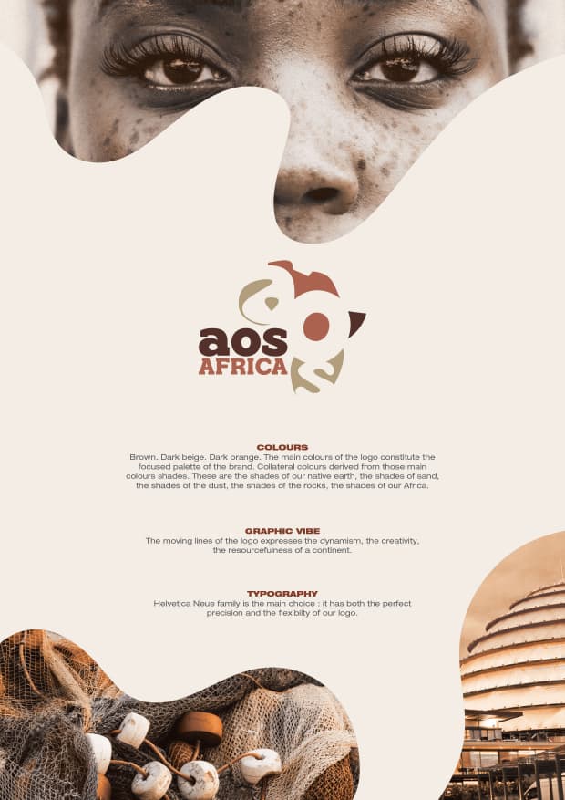
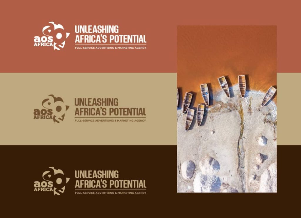
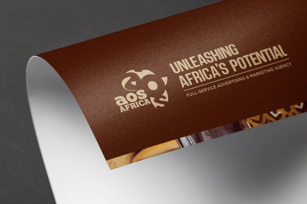
The new identity brought a clear structure that connects divisions into a unified whole, using visual elements that echo Africa’s vibrancy without confining it. It creates a confident presence that speaks with clarity across touchpoints. For clients, partners, and audiences, AOS Africa’s new identity has shifted the brand from multiple messages to one coherent voice; a voice that now communicates purpose without ambiguity.
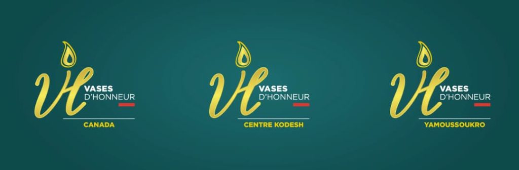
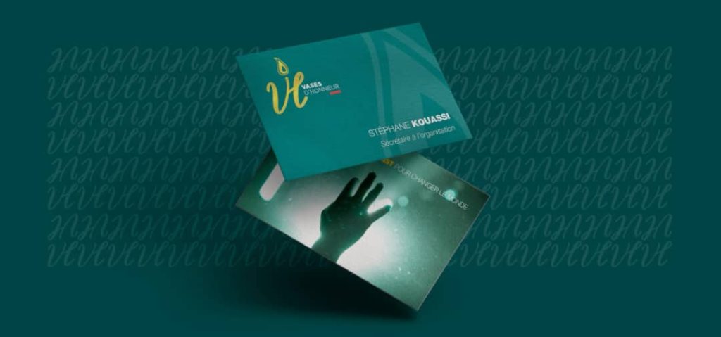
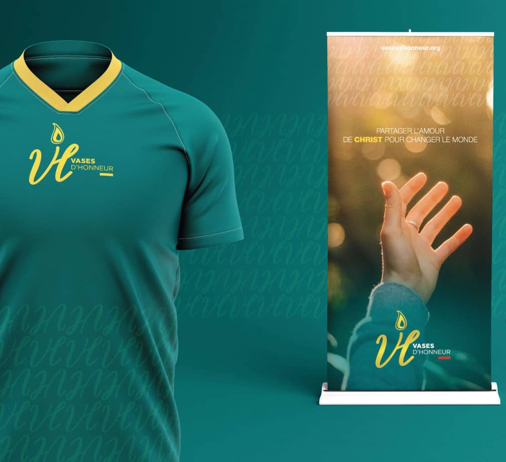
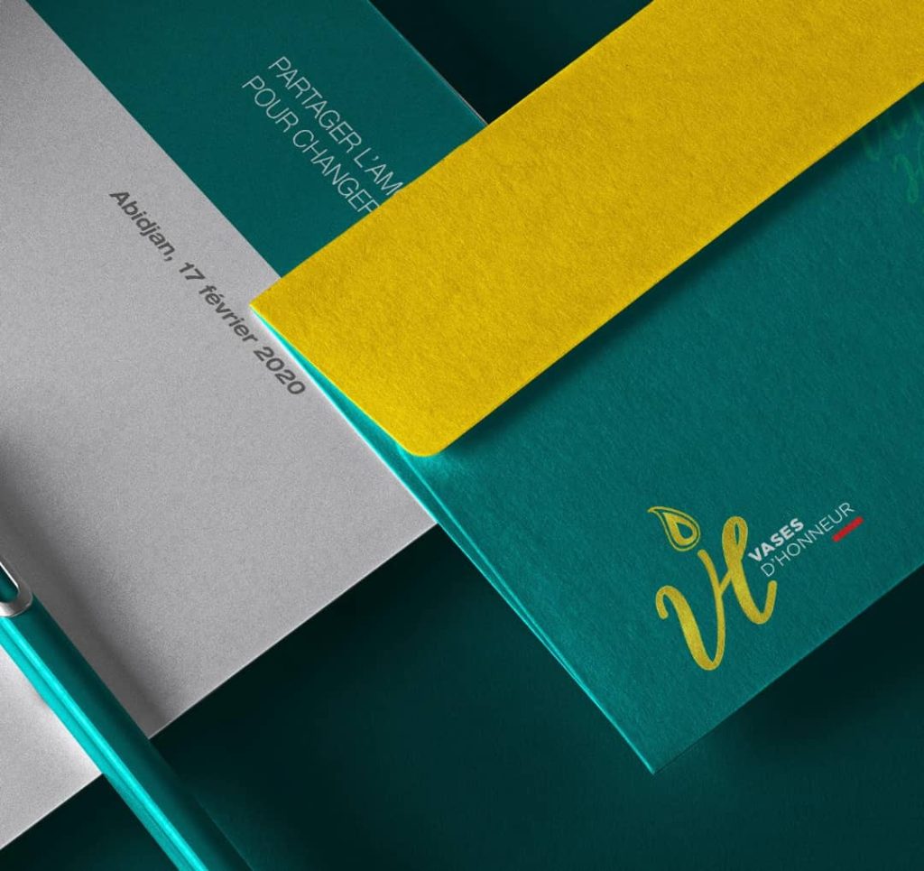
Vases d’Honneur: Unveiling the Sacred Through Design
In another project that exemplifies his sensitive visual ear, Vilevo took on Vases d’Honneur, a spiritual and religious institution seeking an identity that matched its profound mission.
Here, the challenge was emotional and sacred; the old identity had functional elements but lacked symbolic depth. It did not reflect the richness of the institution’s mission, a mission steeped in faith, honour, and spiritual continuity.
Through careful study and reflection, Vilevo found his anchor in the concept of The Anointing: an idea rooted in burning conviction, sacred oil, and enduring faith. From this emerged a visual identity that communicated:
• Reverence
• Hope
• A soul‑anchored sense of purpose
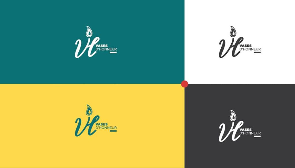
In its colours, typography, and visual structure, the new brand system reflected not only aesthetic strength but a profound cultural and emotional reality. This was far more than a redesign; it was a revelation.
Across these projects, a clear pattern emerges: the focus isn’t on trendy visuals, but on strategic dialogue. Rather than simply decorating brands, Vilevo engages in a conversation with them. He listens carefully for what they’re trying to communicate, even when their message is not clearly expressed.
This is what differentiates meaningful identity work from surface design. Where many stop at aesthetic appeal, Vilevo dives deeper into cultural roots, audience cognition, and narrative resonance.
His identity work treats a brand as a story expressed through symbols, uses visual language as direction rather than as ornament, and pursues clarity as a means of strategic resonance. In doing so, it teaches designers that the real value of their work lies in what it means, not merely in how it looks.
Today, Vilevo Symenouh embodies the impact of purpose-driven design. For him, a brand’s visual identity is the voice, the story, and the soul of an organization, giving form to what it believes and inviting others to listen.
“A company with purpose feels human. As a graphic designer, I help companies and individuals let that humanity shine by building strong visuals and relevant brand identities so that they can deeply connect with their audience most effectively and sustainably,” Vilevo shares.
To Designer Tribune, Vilevo Symenouh represents the model of the modern African brand identity designer: thoughtful, fearless, and unwavering in his dedication to reshaping the visual language of the continent.